Ecommerce features have the potential to make or break a ecommerce business in today’s date. No, copy pasting the competitors’ features altogether isn’t the optimized way around and yes, that’s exactly what the BinaryFolks core ecommerce consultant team can help you figure out !
Does the success of a transportation company solely depend on the condition and model of the vehicles it possesses?
Think of a Limousine with a terrible chauffeur..
Hold on before you think an ecommerce industry insider has nothing to do with that piece of information, because I’m about to tell you why it does.
Replace ‘transportation’ with ‘ecommerce’, and that explains why the offerings are not the only factor controlling your business growth, and an ecommerce website & an app acting as a virtual marketplace, holds just the same importance (if not more)!
Having a 360 degree knowledge of the ecommerce development process is undoubtedly a good starting point, but it takes a deeper understanding of the ecommerce features to add ‘efficiency’ to the digital business processes.
Let’s jump straight to the list of ecommerce features without further ado!
Get Free Ecommercee Consultation
Ecommerce Features – What You Need To Know (& Develop If You Haven’t Already) !
Smartphones, for sure, are a device almost all of us are glued to during most of our free minutes. But then, a lot of your target customers are working- be it from home or from office space, they are spending long hours in front of the laptop/desktop. Thus, to talk about smartphones or websites first, is a chicken and egg decision. We did a toss and it says let’s discuss ecommerce website features (which are common for a mobile app as well) first and then talk about the app or website dilemma, so here it goes!
Look ‘n Feel
.png)
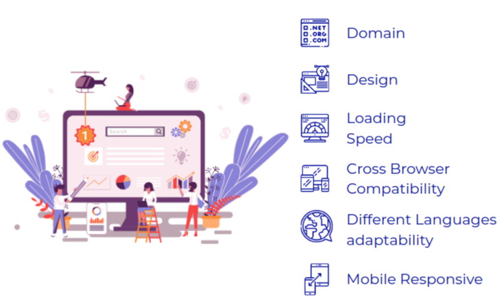
[1] What’s Main In The Domain?
Sitting at the top level, domain marks the entrance of your website and so, setting it right is a must. Make sure your domain has –
- An ‘s’ added to the ‘http’ i.e. a secured connection
- If you are targeting a single country exclusively, don’t forget to use a country code. Ever thought why Amazon has made it amazon.in instead of keeping it unified simply as amazon.com? So that it comes up on a relevant search carried out in India !
.png)
[2] Is your website looking like it’s “YOURS”?
Appearance can be copied, personality can not! While a handful of other competitors can use your color theme making their website look closer to how your website appears (or even someone from a different business altogether, taking inspiration from your UI) , but like a nameplate on a door, a theme aligned with your business type & your logo positioned prominently on the header can make all the difference! For example, if you are one selling travel gear, on the welcome page, a picturesque backdrop of Northern Lights with the focus on camping essentials where one can easily find your logo can do wonders.
.png)
[3] Remember Your Site Can Learn Different Languages & Impress A Bigger Lead Base!
Leading online stores are not making their platforms available in multiple languages for no reason – like most of their investments, this too is a calculated one. The reason is, even though the number of english speakers top the list of most spoken languages, it’s (very) closely followed by Mandarin Chinese speakers and so on, meaning, translating your website in another language alongside can actually expand your reach. That doesn’t mean you need to translate your website in Mandarin Chinese, since it’s not the global language stats that should be your concern, instead what languages your target customers speak should decide the second language for your platform.
.png)
[4] Train Your Site To Load Before They Think They’ve Lost Connectivity!
The difference a second can make in an ecommerce business’s growth is unimaginable. First they will check if their connectivity is lost and then, they’ll leave & all of this under no later than 3 seconds – shortest horror story for an ecommerce insider? Well, a slow loading site in a fast-evolving world sure deserves no mercy at all, as all it does is knock over a domino series – the loading speed affects user experience, a poor experience blocks user engagement and finally less user engagement directly damages OpEx & revenue. So, eye a loading speed of 2 seconds to get going on the growth street.
.png)
[5] Your Site Shouldn’t Be An Introvert To The Browsers
Cross-browser compatibility can glorify or cripple an eCommerce website and you can’t help but nod at this, because while some eCommerce websites appear absolutely flawless in one browser, it looks completely unorganized in another. Been there, faced that? Don’t be ‘that’ website. Instead, develop your site in a way that it appears well in all popular browsers, incorporating one of the most important ecommerce features i.e. browser compatibility.
.png)
[6] A website running on desktop and losing shape ‘n structure on smartphones is an absolute NO-NO!
The prime objective of any website is to reach its target audience and what better way to do that, than making its view compatible with the commonly used devices! A responsive website runs over desktops, laptops, smartphones, tabs etc. with equal efficiency, so whether a user is at his desk or one is on her way to office, accessing your website is not a problem.
No-Nonsense Navigation

Without a guided experience, even treasure hunts would have failed to reach the treasure, leave alone your customers reaching their product coming up in some random corner of a random webpage. So, the goal is to hint them where it is as clearly as possible, layered with the ongoing offers and newly launched items that they might not want to miss out on! Below are a few ways to kill chances of “burying a lede” err..”burying a lead” !
.png)
[1] Well Researched and Well Placed Parent Categories
The top part of the page is ideally where your customers’ eyes gaze just after clicking on your website and the parent categories showing up on the navigation bar has the power to make or break the user’s experience. A powerful keyword tool (like Google AdWords) eases your research on fixing parent categories, handing you over the search terms that your target audiences have been using lately. With such a category list set aligned with your customers’ popular search intents, along with better customer retention on your website, pulling your website up among the first few search results becomes easier as well.

[2] Smart Subcategories To Save Space on Homepage
In simple words, parent categories give you an overview of the floors of a multi-storeyed building and subcategories specify the rooms in each of those floors. Coming back to the ecommerce website scenario, unlike parent categories, subcategories are created to specifically guide the users to the products through a more focused grouping. The main objective of introducing smart subcategories is to save space on the homepage, without losing those click-throughs for better conversions. A ‘Hover’ method scores high in terms of convenience and draws attention to the nooks-and-corners of your website without shading over the ‘sales and offers’ you want to bring to their notice.

[3] Don’t Make Them Search For Your!
I was trying to find a gift for my niece’s 5th birthday and wanted to come up with something that’s not on Amazon, thinking most of the other invitees must be turning to Mr. You-Say-It-I-Have-It (a study says so, too!) ! Playing the cool uncle that I thought I am, I entered this real showy website for kids’ stuff and one could tell, if it was not virtual, I won’t have as great access at this e-store, simply because it would have been swept off with all sorts of kids dragging their parents in for fun, if not a lot of nagging to buy toys. As I went on to ‘search’ for “Steffi doll with kitchen set”, I realized that for search all that was ready was the term in my head but not a search bar on the website to put it on! I crossed the tab. That’s the significance of this ecommerce feature, clear-cut search bar, if it’s not there (or not visible at the first few casual sights), hard luck with user retention on your website. To have a powerful search bar embed on, ensure the below :
[a] Complete Their Sentences : No one likes typing the entire sentence, including your customers. They are sure you’re smart enough to complete their search terms – don’t disappoint them, just introduce autocorrect and predictive phrases.
[b] Listen To Their Needs : The office-goers among your target customers don’t like typing off their working hours and that’s no secret. Make their web experience effortless by simply lending an ear to what they are searching for and to do so, an AI-driven voice search module is the best bet.
[c] Keep It Clutter Free : The reason why we don’t spot something is not always that it isn’t there, sometimes, it’s just amidst a heap of clutters, that we don’t want to look into. So, make sure your search bar is not randomly put in the middle of an array of other icons/ elements.
[d] Focus On Reversing The “No Search Results” Effect : “Sorry, I found nothing that matches your search” These few words are the reason for major frustration and in this Covid era you can’t deny that. Pretty reasonable, because if you type out “See Through Umbrella” & they fail to fetch results because it’s stored in their database as “Transparent Umbrella” – it’s not your fault. Be that business focused on fixing online buyers’ pain points by understanding what they really mean. A well researched NLP module can take up the task.
Product Features
.png)
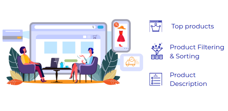
[1] Your Star Products Deserve The Limelight, Don’t Deprive!
The first impressions last, so, you better not create a bad one! Homepage is what your users mostly bump into and that’s your golden chance to make their time worthwhile. Arrange the best of your product or offers on your homepage and stick them to your website, so they stay some more, browse some more and high chances, buy some, more than planned.

[2] Product Filtering & Sorting Option : Let Them See What They Like
I remember in my early online shopping days, I used to go through the entire list of day’s special deals to find out if there was any discount going on in the footwear section, only to waste time over clicking on those ‘out of stock’ or ‘out of budget’ – haha, funny, I was unaware of the funnel placed around, I didn’t know about this magic ecommerce feature, filtering & sorting. So, I missed out on convenience but your website shouldn’t. Thus, incorporating a well defined ‘Filter & Sort’ module will save their time and enhance users’ experience.
.png)
[3] Product Description
Product descriptions, in short, act as a middleman between the product and the person looking at it. This ecommerce website feature holds immense power in improving purchase experience if developed well. Contemporary shoppers are smart and comparison websites are many – while most of the purchases are made after a comparative analysis in terms of specs, pricing etc., it’s your product description that can convince users to settle down with your product. The PD should be three things – crisp, on-point and informative.
User Experience
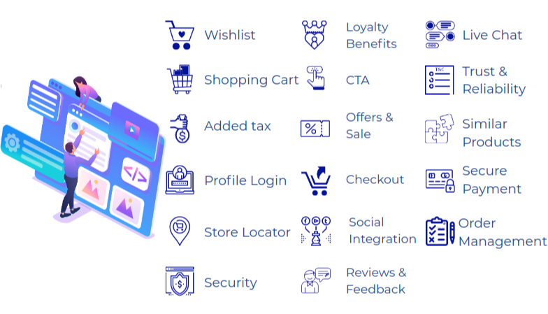

[1] Make Their ‘Wish’ Your Command & Add Them To Your ‘List’ Of Clients
Casual browsing is the new favorite pastime of the millennials and the elderly squad is catching up faster than we can think of! Leave those boring statistics behind, look around when you are travelling in a public vehicle or take a stroll between the series of cubicles at your workspace – you’ll get an idea and that proves my first statement. Now the question is, is everyone scrolling through the e-stores actually indulging in online shopping? Obviously not, but they are “wishlisting”. With a fair share of advantages on both yours and the user's end, this ecommerce feature called ‘wishlist’, certainly makes for a powerful element in ecommerce, if it’s developed to give out –
[a] Low Stock Warnings are the new flyers
Pushing users from ‘wanting it’ to ‘getting it’ isn’t a cakewalk but the right trick can ease the process! A lot of time “Hurry! People are eyeing your tan brown tote” marks the ending of a long wait for the ‘right’ time to buy it, because FOMO. Incorporate that trick sending “Low Stock Alerts” to your users & see your sales soar up.
[b] There’s too much to remember, ensure their wishlist isn’t forgotten
The wishlisted products are mostly of your users’ interest and so, gentle reminders bringing those back in mind doesn’t do any harm. However, make sure to not go OTT with the notifications!

[2] Their ‘Cart’ Shouldn’t Hurt Their Purchase Experience!
The average rate of cart abandonment hovers somewhere around 70% and the factors responsible are many. So, talking about staying ahead of the neckbreak competition, making your cart smart has enormous potential to give you the desired competitive edge. Here are the hacks-
It’s not The Bible, keep the ‘Edit’ option open! : With multiple options at hand, at times, online shopping can confuse the buyer, invoking the urge to switch to a different variety or drop an item just before final checkout. Thus, there’s a thin line between cart processing & abandonment, and that is the convenience factor. It’s how effortless it is to move to checkout, that makes or breaks your lead-to-client conversion rate and a prominent ‘edit’ option beside each of the carted products ensures the former. Here are a few types of common editing options-
[a] Increase/ Decrease the quantity
[b] Delete the item from the list
[c] Integrate with ‘Wishlist’ with an option as “Save For Later”

[3] Surprises are great, unless they come across while processing the cart (and pinch the pocket harder!)
Transparency is an universal demand when it comes to online payment and still, the contemporary ecommerce businesses resort to levying a considerable amount in the name of taxes & delivery fee at the last-minute, troubling them. There’s a good chance that your business can be the chosen one among the pool of similar businesses, if you keep your pricing management system transparent with a tag that your users love, ‘AI’ i.e. all inclusive.

[4] Are You Letting Your Customers “Log In” Before They Think Of Opting Out?
An easily visible ‘log in’ option acts as a welcoming gesture and doubles as a lead magnet. Don’t expect them to inspect, find the registration space and get themselves logged in, instead present a visually appealing “register & login” form that compels them to drop their email/ contact number to explore the e-store.

[5] Keep Your Physical & Virtual Stores In Sync
Not every user is looking at your website for online shopping, some are looking for your physical store addresses, too. So, incorporating a store locator will help them find their way to reach you. However, how you place this ecommerce feature i.e. store locator carries significance too, as the nearer it will be to your top bar, the easier it will be for your user to find you.

[6] Risking Is Legit In Adventure Sports, Not In Ecommerce Websites!
There’s something that all your web visitors are concerned about and that is the risk associated with online purchases. Digging into a granular level, the risks lie majorly in three aspects – one is personal data sharing while registration, second is transaction details and the third is regarding quality and authenticity of the purchased goods or services. While a multi-layered security including SSL certificate, PCI compliance and a strong firewall ensures the first two security concerns, it takes a user-friendly return and refund policy to curb the third. SSL certificates can be from well-known CAs and their products like Comodo PositiveSSL Wildcard, RapidSSL certificate, GlobalSign SSL certificate, Thawte wildcard SSL, etc. All these SSL certificates are up to the mark and offer strong 256-bit encryption.

[7] In This Era Of Backups Loyalty Doesn’t Come For Free
How many times have you tried a restaurant because a colleague-next-desk has recommended it? Quite a few times, I bet!
Same story, different context. Word of mouth marketing goes a long way. The number firmly supports the statement too, as reportedly 84% of consumers go by the recommendations of others over other marketing methods. So, ask them to recommend your brand name & treat them with some striking offer in return. Sounds like a win-win?

[8] If You Don’t Call, They Won’t Respond
Remember, your users have countless choices (or, countable but many, in case your offering is not-so-common), but you can’t let go of individual users because every visitor coming to your website (well, almost) is a potential buyer. Your goal is conversion and a prominent CTA is a tried & tested way to achieve so. CTA is the ‘long story cut short’ element that reduces the hassle with it’s single click functionality. Now comes the question, “Where to place the CTA?” Placement of a CTA sure has a lot to do with how effectively it triggers the click through. Here’s a list of placements that have decent conversion records:
[a] Top of a web page
[b] Bottom of blog posts
[c] In the sidebar
[d] A greeting pop-up message
[e] Mid Part of a long blog post
[f] Email marketing content

[9] Tucking The Promo Code Punching Space In Some Random Corner Will Do More Harm Than Good
A freebie should come easy. Imagine yourself ordering a java chip frappuccino from the ‘offer of the day’ and then instead of serving those free cookies with your order, the Starbucks waitress simply asks you to find the cookies yourself – weird, for sure! Same story, different context. If you’re leaving them with a loyalty reward and not a convenient way to use it, you better fix it before the impact reverses, affecting your bottom-line. Make sure you :
[a] Highlight the coupon / promo code punching space on the payment page
[b] Provide an option to copy paste the code so one doesn’t have to exercise their brain hard to remember a confusing concoction of alphanumerics

[10] Seamless Checkout
Stats shows, nearly 87% of online shoppers abandon carts because of a complex checkout process and that explains why the checkout module screams to be easy. Here’s the tricks to adhere to the K.I.S.S principle while planning your checkout module :
[a] Auto populate your customer’s shipping address with the billing address provided & keep an ‘edit’ option visible nearby, so they can change it in case both are not same
[b] Help them save card details securely to reduce checkout time, because it takes significant time (and patience) to fill in the credit/ debit card details
[c] Try and keep the entire process confined within a single page. Your customers will hate being pushed from one page to another, forced to fill multiple fields that you might never need, making the checkout process a lengthy affair, when all they wanted was to buy a $5 stuff. Keep off that embarrassment!at embarrassment!

[11] Whether Your Store Is Virtual or Physical – If Your Brand Is Not Social, You’re Lacking The Trump Card
With ‘emoji’ becoming the Oxford Word of the Year back in 2015, do you still think social media is a slime play? Let’s face the truth – given the fact that unlimited email notifications cause disgust & not visiting your e-store everyday doesn’t impact your customers’ daily lifestyle, there’s no better place to show up as a subtle reminder of your existence than social media. What are the stepping stones? Here’s the list :
[a] Snapchat may work for a cosmetics brand but won’t be any close to effective when it comes to a disinfectant brand. That implies, different social media consists of people with diverse interests and which platform has your target users in abundance shouldn’t be a gut feeling.
[b] Therefore, step 1 is to research the suitable one from a pool of social media platforms.
[c] Embed the social media icons for quick attention – a blue box with ‘f’ within is what most will notice, not “FACEBOOK” written flat.
.png)
[12] Reviews From The Horse’s Mouth
People will be more interested in your offering if something tells them that it's authentic and reviews are that ‘something’. It’s the virtual version of liking your friend’s smart watch and asking if it’s worth having. Wondering how this ecommerce feature, review, should actually be? Have a quick look :
[a] Allow them to put images. The image you put on your product description tells them what to expect and the same thing placed in a buyer’s space tells them how close the delivered stuff is to the expectation, to save the online shopping fails!
[b] Attach a ratings space for quick understanding
[c] Summarise the reviews with a small analytics space so the users can have an overview of what the buyers’ are saying without actually having to go through the detailed reviews.
Read More : How to Develop an Online Reputation Management Software

[13] Why force the “Can’t Talk, WhatsApp Only” Squad to Talk – Think Live Chat!
“We don’t talk anymore, like we used to do”.. ..because we are more comfortable chatting these days and that’s fast & less frustrating, too. The process of online shopping isn’t just “I saw. I bought. I left” anymore, it has expanded to a monstrous level involving steps like : looking at some other sites, comparing facilities, getting back, leaving again and maybe purchasing after browsing ad infinitum. So, save their struggle, flaunt your live chat customer support module at a space that will instantly catch their attention & that’s it. To add to their convenience one notch above, consider integrating popular chatting apps like Whatsapp & messenger that will help them get their queries answered even when out of the site!

[14] Trust Signals (Security Factors) For Increased Reliability
“Looks are deceptive” – they say and then, that’s all you get to analyse while you are e-shopping. To make a purchase with you preferred over others in the same business, this ecommerce feature is a gamechanger. Below are a few trust signals that will magnet your customers in pulling up your sales :
[a] Try & Buy Option – where they get to try the purchased good
[b] Easy exchange
[c] Free shipping on product return
[d] T&C, even though not read most of the times, tells your customers that you have thought through your site and are straightforward when it comes to purchase guidelines

[15] Predict Their Liking To Sell Them More
“You may also like” have sold more than “Our company is the best” kinda claims through average ads. How many times did you go on to buy Peet’s medium roast and couldn’t resist buying the gold lined Northern Europe style fancy mugs? Story remains the same even though the name of products will change for individuals. So, that’s precisely a result of the site following previous purchase patterns as well as identifying products that are in some way related to the product of interest, and an extensively trained AI module does it best!

[16] You can’t ridiculously reduce the product price, but you can at least make the payment process simpler!
Debit/ credit cards are no longer considered an easy way for payment as newer digital wallet options have emerged over the years and gained popularity in no time. Thus, being a sucker for convenience that we are, most of us have turned to those quickies for even the smallest purchases. Given that, the thing has sinked so in, that we have actually started opting for platforms that accept the digital payment of our choice! ‘We’ includes your target customers too & declaring the payment options you accept with an icon will draw them to your website for a convenient purchasing experience.

[17] The Smarter You Build Your Order Management, The Better Your Bottomline Will Look
Every business eyes growth and many of them fail to scale when they get that massive response, calling that ‘unforeseen’. That’s plain and simple hilarious! It’s like manifesting financial abundance and then returning all the money to the source when offered saying you don’t have a spending plan ready yet. To turn the growth curve upwards, having an order management system developed to withstand even high inflow of visitors is a must.
Backend Features
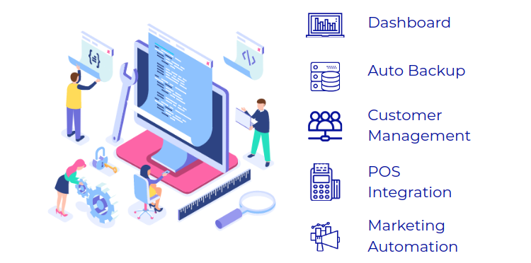

[1] Redoing Your Strategies Will Be A Tedious (& Inaccurate) Affair Without A Dashboards
In the ever-changing ecommerce business scenario, trends come and go real quick – so even the best of strategies don’t seem to work forever. Now, modifying strategies is a big deal & clearly ineffective if left to assumptions. So, having the insights at one place is a must and this ecommerce feature does exactly that. Thus, a well thought out dashboard customized to view all the significant metrics associated with your business processes, is a must.

[2] Avoid The Choose-Or-Lose Game, Keep Automatic Site Backup Handy
Technical mishaps are not as common as we wish they were, on days, even Google goes numb for a while! So, it’s good to have a recovery plan, well, just-in-case. Ensure your site is automatically backed up, so if any such glitch comes up, your website can overcome that in no time. Stay (A)live no matter what.

[3] Customer is the king – treat them right!
Like you need fresh bread for a good sandwich, a CRM module developed aligned with your customer management needs is an absolute must if your ecommerce business eyes to become the discussed name among the customers. While CRM has been making rounds in the market for quite a while now, not all of them are as effective as expected. Reason? A CRM built to satisfy generic interest can no way do justice to the specific needs of a business. So, to ensure your ecommerce business has a CRM that is effective and doubles up as efficient, make sure it can :
[a] Store all of your customers’ data in one place – be it ‘a click on your website menu’, or ‘a tagging on Instagram’, ‘what they purchased / wishlisted’ or ‘if your email was opened’. Keeping track of this detailed history and an analytics space visualizing crucial insights, you can find your customers’ online trends faster and then, improve your serviceline accordingly.
[b] Starting with an example, a brand housing home decor pieces will likely have a diverse customer base. Some customers might like the smart and modern ones (say, a geometric wall clock) while some may solely be interested in those carrying an old school charm (a Victorian corner wall clock, maybe). With ‘who likes what’ matching algorithm incorporated, your marketing becomes more streamlined than ever, as it enables you to reach out to each group along their preferred line – you know it’s never irrelevant to ask the avid reader if he would like to get a set of bookmarks as he carts a couple of bestsellers. Thus, your CRM should take segmentation marketing seriously, with a well developed grouping module funneling you to a fruitful marketing procedure.

[4] Integrating POS Is The Secret Sauce
What’s that one ecommerce website / app element that benefits your business just as much as it does to your customers? Yes, that one among all the ecommerce features is POS integration! Out of all the things that a business expects, an orbital view of the customer journey is a significant one & on the other hand, a hassle-free omnichannel shopping experience is what the customers seek. Ensure you do it the right way by :
[a] Identifying the channels you want to integrate
[b] Enabling cross platform offers & promotions functionality
[c] Syncing catalog between your virtual and physical stores
[d] Updating inventory automatically whenever an inventory transaction takes place, regardless of the medium
[e] Automating both ways data transfer between POS & e-store
[f] Enabling multipoint payment processing

[5] Marketing Talks at People, But Content Talks To Them – Enough Reason To Manage Them Well?
Impressing customers is no happy accident, it takes convincing & unique creative content. And then, how good your content is makes hardly any sense if they are not managed well and that’s exactly why this ecommerce feature, a thoughtfully developed content management system, demands special attention. Try reading the following line.. You are awesome.. Illegible, right? I praised you there, but the poor font size stopped you from reading in the first place – so, mission unaccomplished. Therefore, make your CMS tick the below boxes to ensure your content makes its way to your visitors:
[a] Enable search engine optimisation (SEO) to expand the reach
[b] Consider focusing on :
[i] Page layouts : How the content is distributed over the page space along with visual content placement
[ii] Product description pages : Elements like the total number of products visible above the product listing page, a ‘Go To The Top’ option etc. add more value to your page content.
[iii] Promotional banners and popups : Like the hoardings attract your attention more than an ongoing ad on TV or the Youtube ad you choose to skip ever will, popups & banners do that effectively online.
[iv] Transactional & Advertising Email : A flat paragraph with a ton of words stitched together is the last option (practically, not an option to make a way into your customers’ mind even if it's tailored to their preference. That’s exactly why working on its structuring is necessary to make them go ‘Damn!’ (in a good way) instead of sighing disgust.
Website Or, Mobile App – Let’s Wrap It Up !
For ecommerce businesses it’s difficult to choose when the question is “What do I need to succeed?” and the options are just : (1) A website & (2) An app, because practically both complement each other. That does not imply that with only a website or an app at disposal a business can’t go on- it sure can, but the central point of discussion here is competitive advantage, growing regardless of the rat race. Having both a mobile site and a mobile app (well planned, researched and implemented, obviously) allows your business to reach both the desktop & smartphone squad, making it easier for your customers to explore. In simple words, a website will make your brand a known face and an app will ensure they hang around as loyal shoppers. Even though you can not look at an ecommerce feature and call it entirely belonging to a website, here’s some of what extra your mobile app can do for better customer retention that even your responsive website can’t!
[1] Send push messages that convince customers to engage with your brand.
[2] App Icon is noticed whenever a user fiddles with their phone, thus, increasing brand awareness.
[3] Minimized load time with one-click login & log out
[4] ……………………………………………………………………………………………
[5] ………………………………………………………………………………………………
….the list goes on and gets so long that deserves to be put in another blog altogether. However, it’s not just about the numbers of app-exclusive features, but it’s more about the nitty gritties of how an app functions to increase user engagement, meaning more sales opportunities! Our comprehensive ecommerce mobile app guide can be your friend & philosopher in the process, in case you’re planning your ecommerce app!


